Branding is something that can make your brand stand alone in the crowd of vast competition. It helps leave an impact on your customers, the better branding you have for your bakery the better chances you have for success.
Obviously, why would you leave your branding to chance? The time is an asset and it costs you a lot of money to leave the opportunity to communicate. To interact well with your customers.To make them a loyal customer to your brand.
The skill and passion you rely on to make delicious bakery food is just the start of building a bakery. Getting people in the door to taste and buy your bakery foods is the next and crucial step. You also want them to return again, making branding an important part of your marketing strategy.
In this blog, I am going to share my fantastic logo ideas for a bakery brand. These ideas are from the logos that I have created for my past clients. With unique insights in mind to showcase the value of their business.I want to make an impact on their customer’s mind so that it can give them an extra opportunity to be a brand which is memorable. If we talk about successful brands, only the brands which leave an impact on us and can stand apart to help us remember them. We will be going back to them to buy a certain product or service.
After all, that is what all the brands are trying to do through their unique TVCs, ads, post and everything else. The intention is to be in our heads always.
With each of the logo and visual, I will be sharing unique insights which will give you better clarity that can help you to have a remarkable brand identity.
1. Abstract visual
Have you ever thought what makes your bakery logo idea different from other bakeries?
If you can find an answer – the visual of your bakery logo is very different. It stands itself apart quite easily then it is good otherwise the chances are very high that the power of your logo will just fade away. If it would be seen with other bakeries, and your bakery won’t be very recognizable.
You need to figure what is it that makes your bakery brand unique. Is there any specialty, or some signature that you have that makes you stand apart? If not, better get that figured out because that is something which will help your business to get successful.
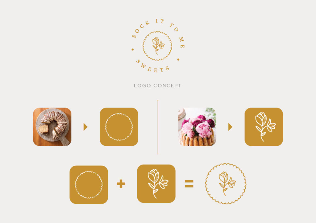
For instance, the above branding that I created for SITM Sweets (Sock it to me Sweets). It is not very clear that we are showing a visual of the bundt cake. What we can easily spot is the flower, which is one of their special product topped by the flowers. The logo is an abstract version of a bundt cake topped by the flowers to help them have a unique branding. This can help them become more recognizable with the time when the customers will know their brand and what they are famous for.
The branding is also designed to ooze elegance and style through the representation of the flower illustration, symbolism of cake and the serif font that has been used for the name of the brand.
2. Irrelevant but Relatable
While designing logos there is one thing that I tell my clients that you shouldn’t think of something relevant to your industry for your logo design.
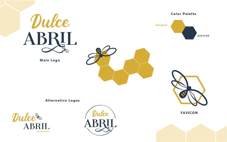
For instance, in my career of the past 6 years from a total of 300 client experiences, roughly there must be hardly 20 instances where clients themselves have told me an idea which isn’t something directly connected to their industry. If you would see in the above image of “Dulce Abril” there is a visual of a bee that we have incorporated in this branding design. So, while talking to the client, we found out that personally our client was really fascinated with the bees. Somehow she was very much inspired from them. We decided this can be something that we can use as a unique brand image.
Most of our clients would have rather asked us to add an egg beater, a cake or something else that relates to the cake and baking if it is about the bakery. I can understand that it is the first thing that comes across our mind when we think about the bakery. But as a branding designer, I have always learned that we should never go ahead with the idea that we get initially.I feel it because that is something that almost everyone will think. We should rather go with that 20th or the 100th idea that is unique and it can help the brand to stand out. This would be one of the key advice that I give my clients when working with them.
3. Unique Strategy
When there is something unique that you want your brand to be known for and it is a part of your branding. It is more likely that your brand will be having more chances to become popular.
For instance, when we had a discussion with Lola who is a really passionate baker and a chef. She had a spark that I knew from the first moment. Althoght, she had no idea how is she going to differentiate herself from the competitors. There will be a lot of people. The businesses which are doing just the same thing as she was doing. We had to figure out something that can help her to stand out.
You must be wondering by now what’s so unique about the branding and how did we solve that problem to make her stand out and get recognized. Well! in the logo you can spot a “C” which is an abstract symbol that has been inspired from the swiss roll which is her specialty. Somehow, this is what gave her that inspiration to take her passion and turn it into a business.
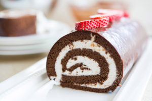
We also proposed that no matter what she bakes or prepares, she will be adding this “rolling C” shape while presenting that dish. It can be made from some ingredient on top of the recipe or there would be a little rolled C symbol made of chocolate in the serving. We wanted her customers to take away some unique memory. Something, which will become iconic with time and customers will always remember her through that.
In these confusing times where every second we are bombarded by so many ads and promotions. The brand which can make your memorize something about their brand can become much more successful.
4. Relatable but Unique
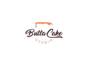
Often, we are challenged by the clients. They don’t want to make away where they will be showing something unrelatable for their logo. They want their customers to give a direct idea for what they stand for.
We believe sometimes we should listen to clients too and to what they need. It is important to leave our stubbornness and designer’s ego. We have to let go and wear our serving shoes to cater to our client’s needs.
Although it is always better to showcase something that has no link to the industry. When the client wants something direct like they want to show a cake in their logo or something similar. We put our minds to think now how can we portray a cake without actually showing an actual cake in the logo. And the solution is taking an abstract approach to a cake, which brings a cake to your mind but we aren’t actually showing you a cake. We take the help of shapes, relatability, and something that can make you think of something by giving an abstract idea. Now because of smartly making you think of something that we want.
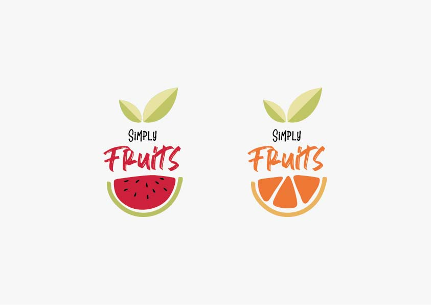
And sometimes that strategy can take an advance and higher innovative approach. For instance for a client who was serving fruit bowls and juices. We created a logo that can be changed or customized to represent different flavors, or products depending upon the main ingredients.
5. Simplicity and Depth
One thing is for sure nothing can bet the simplicity. When an idea is simple and it has some depth, that idea can go far distances without losing its effectiveness. A simple idea when gets connected with an insight to communicate. It helps them to understand one of the brand values. They can later associate to that brand when they interact with the brand. It can be either directly buying something or it is someone they know communicate it. The idea gets absorbed deeply. Now they will always remember the brand through that unique idea or the insight.


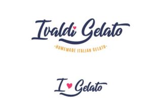
For Ivaldi Gelato, her main reason for being successful in the business was her genuine intention to add happiness. Happiness into the life of people through her gelato, and adding smiles on her faces. She mentioned also that she is there in the market not just because she loves to make her gelato and serve it to people but also wants her customers to love that. Eventually, which lead her to constantly improve her taste after the genuine response of her customers. Also I tried to add in the logo.
In the case of responsive applications of the logo the smaller version will be “I Love (heart symbol) Gelato”. We have used this logo to make the logo user friendly. A longer name is hardly visible in the small sizes. This is to improve her visibility while communicating something on which her brand stands.
Taking the plunge and deciding to take your baking to the next level is a big one, but it’s not impossible to have a successful bakery if you have the baking skills and the right tools to promote them. Can you think of more scrumptious bakery logos with fascinating stories trailing behind them? Do let us know in the comments below.




2 Comments
Like!! Thank you for publishing this awesome article.
Like!! Great article post.Really thank you! Really Cool.