The renowned Russian painter and art theorist Wassily Kandinsky, who is often regarded as the pioneer of abstract art has so rightly quoted – “Colour is a power which directly influences the soul.” The capability of colours to affect our psychological state of mind has been existing since time immemorial. Colours have a strong ability to alter your decision making, alleviate or aggravate your mood and affect behaviours& perceptions. Therefore, the concept of colour psychology is not alien to marketing techniques. And especially for a brand to stand out amongst several of its competitors, the Right choice of colours is of utmost importance.

Before we explore the concept of colour psychology in detail, let us first understand what it exactly signifies – Colour psychology is the study of how different colours affect our decisions, perceptions and behaviour. The right choice of colours for a brand is capable of attracting customers and persuading their inclination towards your products. Colours enable a brand to showcase and project them the way they want to be seen and perceived by their customers. This is an effective emotional intelligence tool. It is a very powerful non-verbal communication of the vision of a brand. Knowledge of Colour psychology helps bring the brand’s vision and customer expectations in sync with each other. So it won’t be incorrect to say that the wrong choice of colours can ruin a brand marketing strategy.

Colour theories are so essential that NASA provides free online tools to help people choose the right hues. Several renowned brands have strategically chosen colours for their logo to appeal the right consumers since colours convey a message to the masses. For instance–The logo of VISA consists of a dark blue hue to convey reliability and trust which is essential for an organization that deals in monetary transactions. Xiaomi has another interesting story to tell. Their logo is orange, which helped this Chinese company stand out and get noticed during its initial expansion in the western market when most of the other competitors preferred more basic colours like red and blue. Well, A smart example of how thinking out of the box can define your individuality and catalyse your brand growth.
However, a dynamic aspect of colours is that their perception varies and is dependent on many socio-cultural and scientific factors. For example, White is considered to be a colour of peace, tranquillity and harmony, yet in some cultures, it is considered inauspicious. Red can signify energy and excitement, but can also be a sign of anger and aggression. Scientifically speaking, the human eye is stimulated by 3 colour sensors and this data is interpreted by the brain. Since light is comprised of an infinite number of wavelengths, what the human eye sees might not be the reality. Simply speaking, our brain is capable of identifying and perceiving an infinite number of wavelengths from the colour spectrum. While shortlisting colours represent your brand, all such factors must be taken into consideration. Let’s take a deep dive into complexities and effects by choosing the right colours for brand recognition and marketing:

- Why choose the right colours? – The capabilities of the human sensory mechanism are immeasurable. Our brain derives perceptions based on what we see, hear, touch or smell. Choosing colours for your brand would register in people’s brain and create positive or negative perceptions based on your choice. The purpose is to convey a message to potential customers – for instance, warm colours like peach & pink represent feminism, compassion, romance & empathy. When balanced appropriately, this colour would represent all these traits on behalf of your brand. Shades of pink are commonly seen in feminine & kids’ products. Black, on the other hand, represents sophistication, control & independence. However, it can also show depression, mystery & evil. It has an immensely powerful impact on viewers and too much of it can represent your brand as negative, therefore, its usage must be carefully determined.
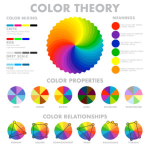
- Understanding of the spectrum – Careful understanding of the colour spectrum is a helpful tool in the decision-making process of the choice of right colours for your content. Let’s begin with defining primary colours – Red, blue and yellow are considered to be the primary colours which can be mixed to create another set of secondary colours like yellow and blue creates green when mixed. Red & yellow create orange whereas blue and red create purple. A step ahead is the tertiary colours – these are created when one primary colour dominates the other in the mixing process.
Then comes the art of intensifying or toning down the colours. Adding white to your colour shades creates a pastel hue. White additives are also referred to as tints. Tints are preferred when colours need to be brightened up.
On the contrary, we achieve a shade when black is added to any colour – creating a darker or dull impression.
However, if black & white (commonly referred to as grey) are added together to any colour, we achieve a tone. Addition of grey in different amounts helps in adjusting the intensity of any colour.

Here’s a pictorial representation of the colour wheel – commonly used by artists all over the world to study and choose from the vast variety of shades.
The colour wheel also distinguishes between warm and cool colours. Red, Yellow, Orange and similar shades represent warm colours that & as the name suggests represent comfort & warmth. They remind us of sunlight & heat, whereas cool colours like shades of blue and green have a calming effect and remind us of water, snow & sky.
Understanding of the colour wheel is crucial during the decision-making process of choosing the right colours for your brand.
- Colour balance techniques–Another important aspect of your brand being represented through colours is the choice of two or more shades each distinctly showcasing the brand’s differentiation characteristics. Let us begin to understand this through an example. The Amazon logo has black as its dominant colour which is accompanied by a beautiful shade of yellow. Black symbolises power, strength and it emphasizes the text in a bold font. Whereas the yellow streak, which looks like a smile, represents a focus on customer centricity and adds the much-needed lightness to the whole picture. This colour combination of black and yellow is eye-catching for customers and is also used in other brands like Next After& Best Buy.
The Usage of two contrasting colours adds a spark and balance to the image of your brand. However, caution needs to be applied so as not to mix too many colours as this could create a complex brand image or uninvited confusion among customers. A careful analysis of the target customer population and the kind of product helps in determining the perfect set of colours. Green colour symbolizes growth and balance. This was a perfect colour for Heineken when it created the first green bottle for their beer way back in 1864. It instantly made the brand stand out from regular brown bottles and is still being used the same way representing freshness and a welcome change.

Interestingly, there would always be exceptions to rules. Google stands out as one of the rare brands that use multiple colours in its logo – a stark contradiction to what we just discussed. According to their designer Ruth Kedar, the colour scheme indicates that “Google doesn’t follow rules”.
- Using shades, tones & tints appropriately–We have already shed some light on the concepts of shade, tones and tints. Choosing among these factors is equally essential as choosing the right colours. The colour represents the whole idea of your brand more broadly; however, tints, shades & tones represent the mood and intensity of those emotions.

The importance of these factors is essential now more than ever, with a lot of digital media exposure, customers have very little attention spans. To ensure that your brand is visible, the hues have to stand out, however, not so much that people would rather not look at them.
That is where the balancing comes into the picture. A careful and aesthetical attempt at creating the right tints and shades for your brand goes a long way.
- Considering colour vision deficiency–According to a study, around 300 million people in the world suffer from colour vision deficiency, commonly known as colour blindness. Most people suffering from this disorder are unable to completely see a green or red light, meaning they will not be able to identify elements about these colours, not just in their entirety but also in secondary & tertiary forms. For instance, blue and purple, both the colours will appear blue to a person who cannot identify the red colour.

The colour for Facebook was chosen “Blue” because Mark Zuckerberg is red-green colourblind and can see shades of blues, the best. Many brands have been considerate about this fact concerning their customers, making Blue one of the most widely used colour since it is least affected by colour blindness.
To ensure that colour blind people have the least trouble identifying your brand, high contrast must be used when using complementary colours. Also, the addition of graphics and text is preferred. This way, the visuals are identifiable and easily readable even to the colour of blind people.
- Tapping the Emotional quotient–All colours are a form of energy. They are capable of evoking memories, emotions and creating nostalgia. The Colours bring out both positive and negative emotions in people – A lot of them depending on personal experiences too. Brands believe in researches based on the effects of colours on the psychology of customers and how colours used in their brand promotion are going to make an impact.
Usage of yellow colour signifies optimism, cheerfulness and intellect, whereas turquoise represents clarity of mind. Gold signifies triumph, achievement and luxury pointing towards material extravagance. Undeniably, the colour choice for your brand’s representation is directly proportional to customer emotions. An honest and clear colour scheme helps your brand become more relatable and reliable. People love to remember visually pleasing images and this can make them choose you over other brands.

Here are some of the common representations of different colours for better insight:
- Yellow – It’s the colour of celebration, auspicious events, optimism and intellect. However, too much of it might suggest criticism & cowardice
- Red – Considered the most energetic, passionate & determined colour. Yet is a symbol of danger, anger and aggression
- Orange – A beautiful blend of red energy& yellow optimism, the orange colour represents motivation, warmth& positive attitude
- Pink – Pink is synonymous with feminism – symbolizing love, compassion, hope & nurturing. However, if used more than necessary, it may suggest immaturity
- Green – Green is the colour of nature – suggesting balance, harmony, growth and self-reliance. It may also suggest possessiveness and envy
- Blue – The colour of trust, integrity and loyalty. It represents reliability & responsibility. It’s one of the most liked and used colours worldwide
- Gold – Gold signifies royalty, treasure, luxury, abundance & prosperity, quality & elegance. However, it must be used in sync with other colours to have a better impact
- Grey – Grey lies somewhere between black & white, representing unemotional & indecisive
- Silver – Silvers suggest fluidity & mysterious nature, sensitive & emotional. It is associated with the moon and feminine energy
- Purple – It’s the colour of imagination & creativity. It has the energy from red and reliability from blue, creating a fine balance between spiritual and physical existence
- Brown – It is the colour of support, security & comfort.
- Black – On one hand black signifies sophistication, luxury, seriousness, control and independence, while on the other it is considered mysterious, depressive and evil too
- White – The colour of peace, tranquillity, purity & innocence. Yet, too much of white can suggest isolation & loneliness too
Having discussed the basics of colour psychology in detail, it is evident that the subject is quite dynamic and fascinating at the same time. Some of us never would have imagined that there is so much of the thought process behind determining the right colours to represent a business. Yet, in some scenarios, you might have to give things a try and observe the effects& responses to your colours. The audience might respond to the colours of your content unexpectedly well or not. Your perception and depiction of colour may not be received as intended – both positively or negatively. All the subtle or powerful effects of your brand’s colour would be visible soon after you know how it is being responded to.

You must have an open mind if there is a slightest need to alter your brand’s colours to make sure they are complementing customer behaviour. For instance – Way back in 2000, Heinz came up with multi-coloured ketchup like green & purple and sold over 10 billion units within a mere 7-8 months resulting in a sale of $23 million. The product was, however, taken off the shelves in 2006 due to a decline in popularity.
After all, colour can sometimes be the sole reason why a purchase is made. Since approximately 90 per cent of buyers consider visual appearance when making a purchase and most of the credit goes to the colour.
Let the essence of colour reflect your brand’s personality through your logo, products, packaging, premises & signage.


