Hello my design people, Today I am going to dive into the topic of how I present my logos to the clients.
Especially, In the beginning, when you have just started working on the freelance projects, you have no idea what is the best way to present those logos that you have made after putting in long hours of effort. The process that I am going to show you here has been improved bit by bit after working with a number of clients and learning from the pros from whom I have learnt through my experience in the advertising industry. I never knew what is the best process to present my logos to the clients, so I have taken my experience and packaged it in a way that can be helpful for the people like me searching for answers.
You should present the logos in a way to communicate that vision and idea that is inside your mind clear to the client, most of the times, clients cannot see what you see in that design. And you also need to make him understand how this logo will be beneficial for his/her business, and how it is going to look at their social media handles, website and collaterals etc. It is your sole responsibility to make it crystal clear how this logo would be in reality.
The chances of that logo to get rejected comes down remarkably when you present your logos in a proper way. I have been on the other side of the table when I got started with design clients and I was just mailing jpegs randomly to show him the logo designs and mockups, I can understand how irritating it is when someone rejects your logo right away.
And In that irritation, you just say that the client doesn’t have any creative perspective. Which might be true but actually the problem is on our side. When you create a great product, good packaging is a mandate if you want that product to be a success. Good packaging always helps your product to sell successfully.
One Important thing to note before we even begin, you gotta stop asking your clients-
what do they think about the logo?
You need to help him leave the subjective judgements of his personal likes or dislikes. Your main purpose should be to talk to his logical brain and not to the emotional one.
So through this process, you will help your client to align his thoughts and bring him on to the same page to communicate what value your logo will add to their business and how it is going to be helpful and in what ways.
Enough of talk Let’s come down to the process now,
Process for Presenting Logos
I have divided the Overall process into a couple of phases which would be quite easier for you to understand otherwise it might be a little bit overwhelming and confusing. So, let’s begin.
Design Discovery
This is a step in which you ask questions to your client about everything related to their business, market, target audience, product/services, what do they stand for and what are the words that describe the brand etc. This will help you understand the client and the business on a deeper level, and this would let you and your client to get connected.
One more benefit of this step is that the client feels you care about their business and the logo design, and he could see that you are really passionate about the project. Also when you let someone talk more for the outcome you both desire and you make them part of the process they will feel more invested in the process and you seem like a legit professional who is serious towards the job.
Do not ever go straight to the designing process otherwise that might have your efforts waster when you and client are going for two different outcomes due to a lack of communication.
The goal of this phase is to take all the information from the client’s mind and organize it well on the paper for your understanding and to remind the client about all this that you are discussing when in the end his subjective judgements might take over.
The Final presentation
This presentation is going to go in a few phases
First Phase ( The Goal )
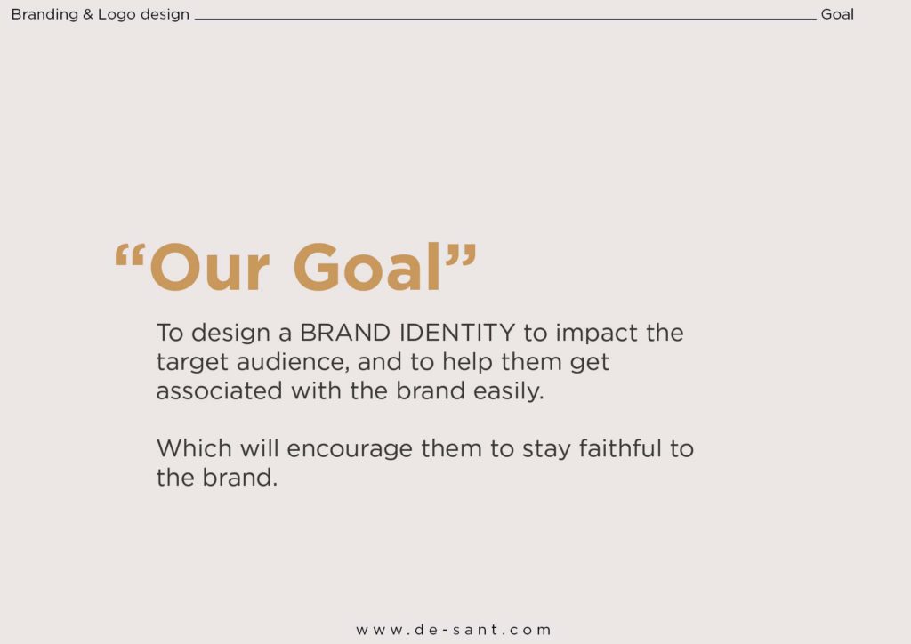
Start from the very beginning, that may sound a bit odd but the goal is to get the client on the same page and to set the tone of the presentation.
This can be really powerful for the final approval because this also shows that the work aligns with the need of the client and in the benefit of the business.
In this phase, you are going to write the goal or reasons for building a new visual identity and why is it necessary.
Write what the client has communicated. It can be something like to have consistent branding, to seem professional and authoritative in the market, Repositioning, better sales and so on.
Phase two ( The Review & Relate )
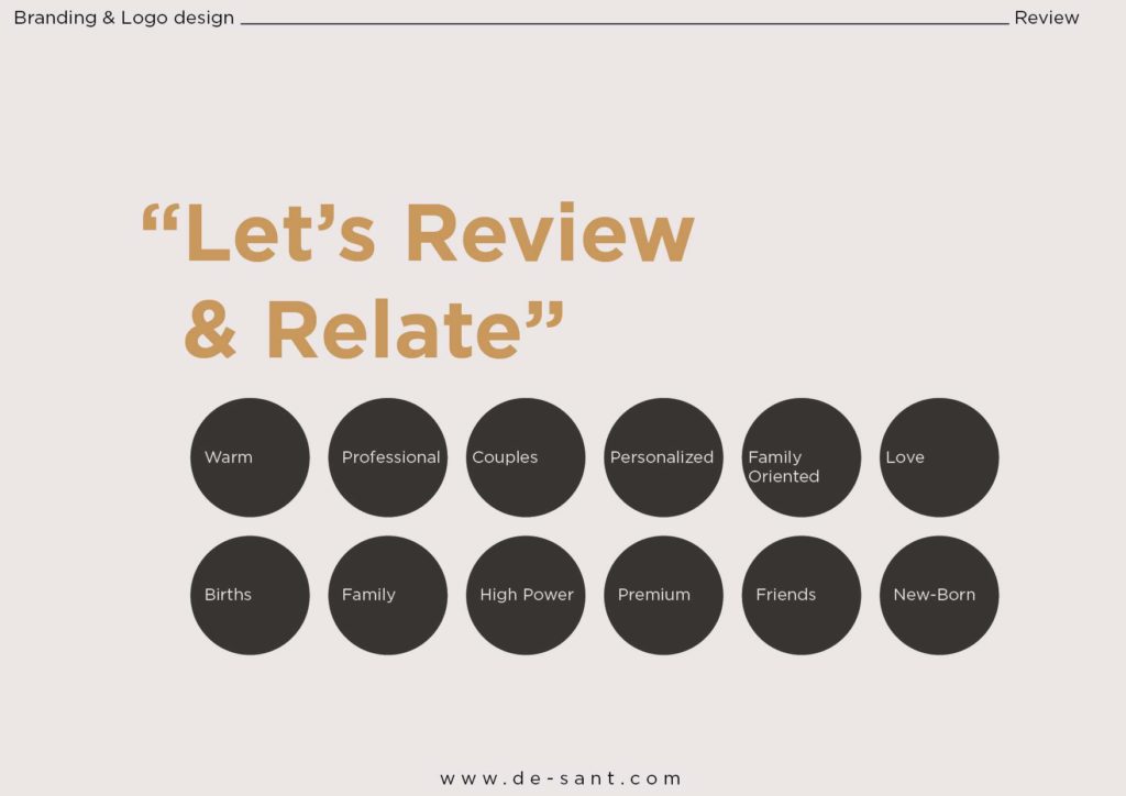
On this page, we are going to write all the words that we took out with the client’s discussion. These words are going to relate to the brand in direct or the indirect way, for instance, fresh, professional, impactful, innovative, powerful, Sweet, nurturing etc. Words you are going to write on this page can be of any number, it might be few or the whole page can be written with a lot of words. Just make sure that it gives clarity, and it doesn’t confuse your client in any way. This is just supposed to be a reminder to the client about what is tonality in which the work has taken forward.
Phase 3 ( The Style Scape or Moodboard )
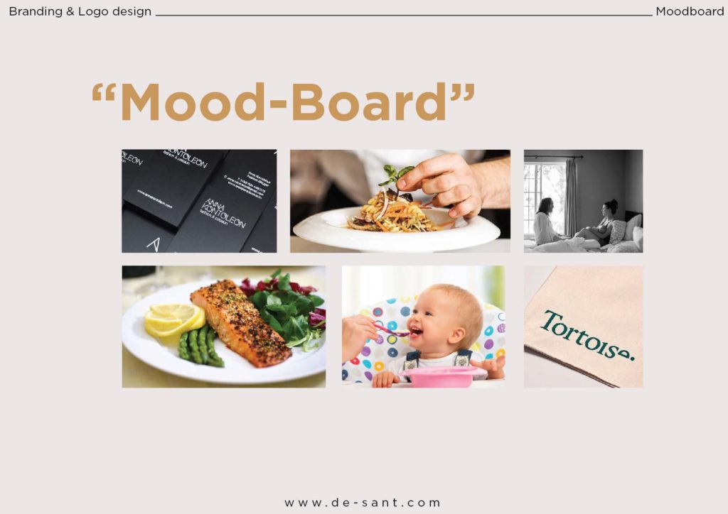
This step is here is to embody the words and the tonality into a visual. This will solidify your idea and it will put everything that has been shown yet into a visual perspective just to get everyone to relate things to and this is the foundation grounds to bring everyone in the room on the same page.
Phase 4 ( The logo Options )
On this page, we are going to show the final logo design. And I can understand if you guys are confused about how many options should you share with the client in the final meeting. I won’t say that there is a hard and fast rule that a certain amount of logos should be shared, because I myself have shared one, two or three logos to the client. Sometimes when I am very confident about the logo and I feel that this is perfect for the client then that’s it. I go by intuition.
You need to put each logo on a single page and write the underlying thought, always remember when you give a little underlying detail or thought behind the logo the chances get doubled for it to be successfully sold.
But I would insist on not sharing too many options otherwise that might confuse the client. I try to never share more than 3 logos to the client. One important advice would have confidence in your work and present it like a pro with the concept note and idea properly presented. You just need to explain the thought behind the logo and make it clear to the client.
You need to first put the logo with the thought written under it then in next page, you will show the logo on a plain white background so that the client can only focus on the logo and see the aesthetic and the beauty of the logo without any hindrance or distraction. You are going to do this with every logo option.
After this page, you are going to split the page into two halves and put one colour logo on each side. Make sure that the colours on each side are contrasting. For instance, you can show the black logo on a white background on the left side and on the right side you can show the white logo on a black background. This will give the client a chance to see how beautiful the logo looks on a single colour. And the contrast on both sides creates visual interest on the slide.
Important Note: Make sure your present logo one by one by which I mean first to finish the whole presentation of the first logo option then go forward with the next option.
Phase 5 ( Small Scale Mockups )
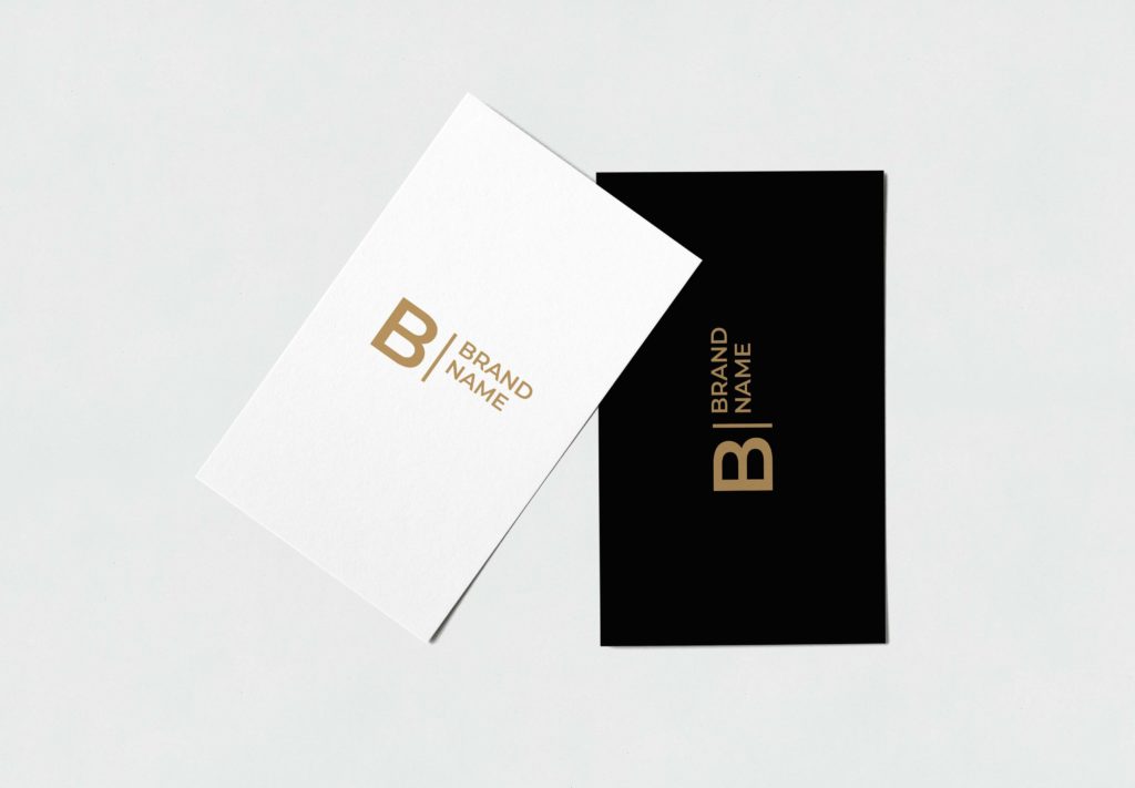
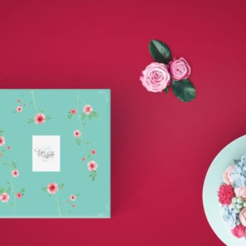
In this phase, you are going to make small scale mockups that relate to the industry you are designing the logo for.
This will make the client look at the real-life small applications of the logo that you have designed. It will also make the normal graphic logo to be more impactful on the smaller collaterals like notepad, letterhead, visiting card, pen etc.
The client should not think about how the logo would look if he goes forward with it when it will get printed in the future. It won’t be very helpful and this might leave him with doubt. So, just to make sure that there won’t be any room for doubts and uncertainties, you are going to show the client how in the real world this logo would look like on the small mediums.
One more benefit of this phase is sometimes this opens the pathway for you and the client to work in future for the collaterals and the brand stationary. This way you can upsell yourself and your services.
Phase 6 ( Large Scale Mockups )
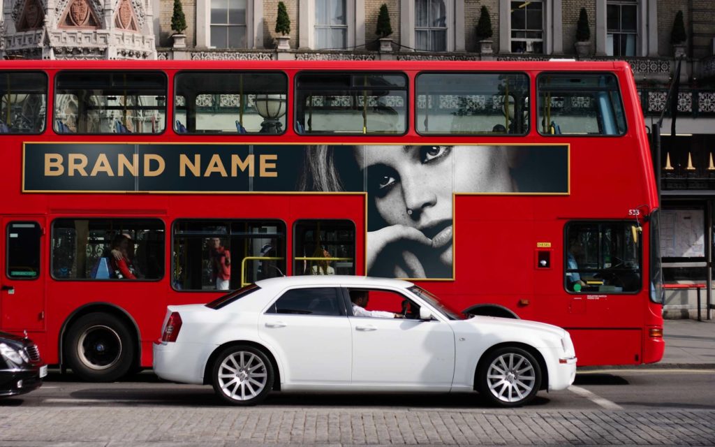
Now after the small scale mockups come the mockups which will present the logo in really big sizes like signage, hoardings, wall prints, logo on buildings etc. The whole idea is to show how it would look on large mediums, because sometimes what happens is a logo comes really well on small sizes but it doesn’t look as good on the large mediums.
It doesn’t matter whether you are working for a small business who are not thinking to get their logo printed on hoardings or signages. But the whole purpose for this phase is the presentation, this might as well give the client the ego boost and the confidence to move further with the logo when he realizes how good the logo looks on hoardings or other huge mediums.
Imagine who wouldn’t like to see their business to be as successful to have their logo and branding printed on large mediums.
Phase 7 ( Final Logo )
After showing all the mockups you are going to bring this presentation again to the final logo on the plain white background.
You need to remember that you need to repeat all of the processes one by one for different logo options and end the slide with the logos on a plain white background next to each other. So that the final decision can come down to the client, now he can think about the whole presentation and decide which logo was best.
One important piece of advice for all you budding designers is that you need the client not to think as per his personal or subjective opinions. You should encourage him to think in terms of facts and logic so that you can bring him to the same page as to what’s best for the business. Things are more likely to get rejected when clients think from a personal level and they think about which option do they like the most. In this case what they will do they will ask for opinions of the people in their circle who will make their judgements purely on the basis of what they like or don’t like. Which can be harmful to an appropriate branding or a logo design.
You need to ask the client to step into their customer’s or audience’s shoes and to look at the logo and ask them whether this logo communicates the values and ideas that this business and brand stands for. That way it would be hard to associate any subjective judgement for the client and it would encourage a fair decision making for the final design that can serve the business.
Thank you guys for reading, I hope you all learnt something from this blog and leave a comment if you think this has helped you in any way or if you have any questions.
