It is scientifically proven that visual images can affect people’s emotions, even before they are consciously aware of it. More than 90% of the information our brain receives is through images and visuals. Our likes, dislikes, perceptions & notions are derived from everything that we see around us.
Daily, we come across several logos and business representations.
Have you noticed why we tend to remember some of them and yet forget the others in the blink of an eye?
Why is it that some of them catch our attention instantly while others don’t?
The answer lies in effective branding and logo creation strategies. Successful entrepreneurs understand the science behind visual representations and implement them appropriately in their business ventures. The basics of designs, logos etc. are indeed the same for all kinds of businesses, yet I believe some industries have an edge when it comes to enticing their potential customers through visuals.
When we talk about cafes, eateries or bakeries, they certainly qualify in this category. It is more likely for customers to select food products from a place whose logo and menu are visually appealing. This fact also increases their scope of being creative. With this idea in mind, I decided to converge my thoughts towards writing about logo essentials for a bakery.
The logo for a bakery must resonate its essence. Baking is an art in itself. The right logo can help a bakery attract customers towards their authentic delicacies in the era of frozen and packaged foods. So let me elaborate a few tips that would prove helpful while designing a logo for a bakery:
The right use of colours:
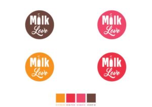
The right choice of colours remains one of the cornerstones for creating a captivating bakery logo. Colours trigger emotions and evoke brand association. Therefore, when you are shortlisting colours for your logo, you are automatically selecting the emotions your customers will experience on seeing your logo. Let’s consider this as an opportunity to tap into the potential customers’ mindset. Colours have psychological impacts and they can convey your brand’s ideology the way you aspire them to communicate.
Traditionally, bakeries have used pastel colours in their logos. This implies warmth and comfort. Contemporary bakers, on the other hand, have experimented with colours to make their logos stand out from the crowd. Vibrant hues such as pink, peach and orange dominate the bakery logos. Interestingly, it is proven that a combination of yellow and red colours trigger hunger. If that is your strategy for acquiring customers, these could be in your bakery’s logo. Shades of green emphasize on healthy eating – if your bakery supports healthy produce, include green in your logo. Use vivid and brighter tones for an added touch of cheerfulness.
Avoiding colours such as shades of grey, marsala, charcoal, oil yellow, black etc. is a good idea. Do not select colours that are dull and shaded. They suppress hunger and aggravate moods. Certainly not the best choice for a happy place like a bakery!
Pertinent images:
I always stress the importance of visuals in any design. By portraying attractive images of lip-smacking scrumptious treats in your logo, alluring customers are just a piece of cake!
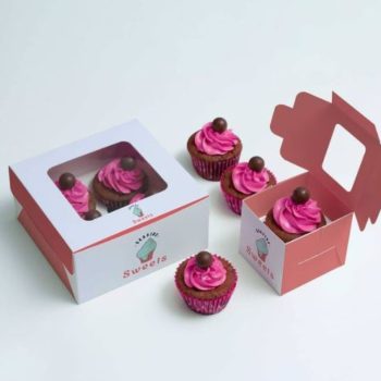
Your packaging provides a visual treat to customers only upon purchase. However, on the outside, it is your logo that provides a feast to the eyes. When we think of a bakery, images like freshly baked bread, droolworthy cupcakes & cookies spring to mind. A lot of bakers leverage these images in their logos as a symbol of what they promise to deliver. Other famous artefacts are baking tools, aprons and utensils that are portrayed on logos. They depict a homely feeling.
Based on my observations, I am listing a few components (and what they might help you represent) that can prove to be useful when included in a bakery logo:
- Cupcakes/ Donuts/ Pastries with frosting – To entice an irresistible urge for your products
- Tiered & decorated cakes – To highlight your bakery’s perfection for custom/themed cake decors
- Freshly baked bread loaves – To take a walk down on memory lane
- Cookies – For that pleasant nostalgic feeling
- Chocolates & its derivatives – Do I need to say more about chocolate???
- Freshly baked pies – To always represent the festive feelings
- Chef’s hat or baker’s apron – To portray the welcoming culture of your bakery
- Baking tools / Equipment / Utensils –To depict home-baked or custom baked effect
- Raw materials / Farm produce/cereals etc. – To depict authenticity and connection to your roots or use of organic and pure ingredients
- Rising smoke – To represent the freshness of your products
Wield the right fonts:
Fonts are the music of your logo’s song.
Different fonts represent a variety of emotions, intonations and cadence in a message. The same logic applies to bakery logos. Imagine the usage of a plain boring font for a bakery – feels like the place probably sells stale food!
It is necessary to choose the right font because font styles convey different messages. The logo font prepares your customers for what lies ahead and what to expect once you enter the bakery. Here you have an opportunity to play with “font psychology”. The purpose is to create your bakery name as memorable as possible. Some fonts represent classic and high-end gourmet delicacies. Some fonts represent fun and casual treats. Retro styles bring back childhood memories and induce nostalgia. Choosing the logo fonts as per your bakery’s theme and ambience is what you must thrive for.
When it comes to fonts, there are numerous options to choose from. But typography is again, an art. If you cannot find one that represents your name appropriately, create one for your bakery. It is eye-catching to see alphabets articulated artistically. The more memorable your logo is the more recognizable & relatable it is for your customers.
Include your forte’:
Your bakery might be the perfect spot for almost every baked item that there is. From donuts to macrons or slices of bread to cookies. Yet, I am sure there must be one delicacy that makes your place stand apart from the others. This reminds me of The Phoenix Bakery in Chinatown, LA. They prepare these 2 tiered fluffy cakes oozing with delicious strawberry whipped cream and fresh strawberries with rings of toasted almond sliver on its sides. The place is famous for these age-old traditional recipe cakes. Anyways, my idea is to include your unique quotient in your logo.
There are several creative ways to include an image or a symbol of your USP in your bakery’s logo. Create a design around this product or include its name – there are endless possibilities to it. If you are unsure about highlighting just one product from your menu, then you may also focus on one category. For instance, if savoury is your strong suit, try to include items from this category. Or if your bakery’s sweet treats are to vouch for, include any of them instead. In any case, ask yourself what your unique proposition is and you would know the answer!
Taglines to tempt the soul:
A catchy tagline can say more about your bakery than just a plain simple logo. It can add a bling to the whole presentation. The tagline also acts as a marketing tool without having to advertise over and over again. It is more likely for people to remember your bakery if there is a tagline associated with your logo. It should incorporate the essence of your place or products. Places like a bakery or café have more impact on people than we think. Customers build emotional connections with such places. This is because your products have been an inseparable part of their best memories, events and ceremonies.
Let me list down some taglines for bakeries that will help you create yours :
- Baking the difference
- Freshly baked Every day!
- Baked with love…
- We create freshly baked memories
- Bringing age-old recipes to life
- Quality baking is our motto
- From Grandma’s kitchen
Create a simple yet elegant design:
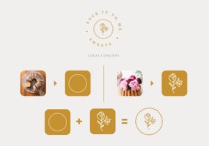
Some of the greatest baked goods are made of the simplest ingredients.
What does it take to make bread? Just flour, water, yeast and salt – and voila! Consider your logo just that. Bring simple ingredients like colour, font, tagline etc. together and create something simple and classic. They are your best bet.
If the logo is too detailed or has too many designs – they are easily forgettable. People do not remember complex designs. The impact a simple logo can make is way greater than a messed up one with too many details. So let simplicity rule your logo.
Bakery logos are usually delightful with fancy visuals. They capture people’s inclination towards great taste. So we compiled a list of some famous bakery logos, including, a few of them done by us, that will help you to create the perfect one for yours:
Chef Lola:
The logo design for Chef Lola symbolizes the baker’s USP. Lola believes that food tastes best when it is fresh. Her freshly baked rolling cakes are simply to die for! And it has been included in the logo design. The colour palette includes black and turquoise – representing luxury, sophistication, refreshing & feminine aspects of the bakery. https://de-sant.com/portfolio/items/chef-lola-branding-and-logo-design/
Fine Crown:
Fine crown Bread & Cakes are an exclusive and premium name. They believe in delivering the best & flawless quality to their customers. Their quest for perfection is what drives their logo. The black and gold are the perfect colours for representing affluence, material wealth & extravagance. The crown design in place of the “W” adds a touch of glamour to the logo.https://de-sant.com/portfolio/items/finecrown-bread-cakes/
Aromas:
Aromesso café in Canada serve their savoury products and pastries with a specially brewed coffee. Their logo looks timeless and yet has a modern approach. The idea was to give customers a feeling of warmth, comfort and oneness whenever they come across this logo.https://de-sant.com/portfolio/items/aromesso-branding/
Claudia’s cupcake:
This bakery’s logo happens to be at the top in many lists that I have come across. Only 2 colours are used to make this logo – thus keeping it simple. The logo’s cupcake Cupcakes” is informal typeface conveys the professionalism this bakery works with.
Dutch Bakery:
The logo has a traditional Dutch flair. It consists of a mill from the Netherlands, the sails made of wheat strands. It gives an impression of the rich culture and local touch of the bakery. The colour palette is warm and simple.
Hammer Sleys Bakery:
The logo has a chocolate colour in the middle that tingles with our taste buds. There is an illustration of dripping juices from strawberries which look mouth-watering. Moreover, the handwritten letters bring joy to the overall design.
Croissant Café’ & Bakery:
This place sells amazingly delicious croissants by a lake. So they merged their two unique features in the logo. The crescent shape of the croissant is used to symbolize a boat. The result is cute, simple and very effective.
Cabinet:
It has an interesting design with its interior as the logo. Inside a dialogue box, there is a cosy setting of a table with coffee mugs, a library & pasties. The logo promises a relaxed environment with a companion. Something that people expect and look forward to.
Goose Bakery:
The logo for this bakery uses its mascot – The goose, bent in such a way that its negative space looks like a loaf of bread. It looks comical and attractive. The O’s in the name “Goose” are marked with stripes that make for bread loaves.
The Cakery:
The logo has a unique ice cream swirl in baby pink hue topped with a cherry for that extra bling. The typography is simple though. The name is written on a ribbon which represents trustworthiness. This is something customers look for when choosing a place to eat.
Merit Art Bake:
The logo is quite sophisticated with a unique colour palette with a light blue hue. A baker’s hand holds a whisk in a triumphant gesture for the logo. Simplicity at its best!
Logo designing for a bakery is a fun-filled yet tedious task to conquer. I conclude this article with the hope that the content would help you create a logo for your bakery. Yet, we are available for all the professional help that you may need at the click of a button!


