Have you ever seen a brand expert making average logos? or a big brand with a logo which is not good enough?
If you are a logo designer obviously you want your logos to be great, it won’t just benefit your client for whom you are creating that logo but also you in so many ways.
- It will bring you more clients when your client will be impressed and he will talk passionately about his new logo and its designer.
- It will make a good reputation in your niche or market. It is more likely for you to make your own personal brand in the market with time if you would keep on doing good work. You will get noticed at some point.
- It will bring you more business as a graphic designer when your client would expand. I have a very good experience with this one when I started my journey as a logo designer after working in advertising for a while. I worked for a client for whom I made a bakery logo, then his business went well and even the logo got appreciated on so many platforms, then he started opening up and taking over new businesses. Due to the good work, he kept on coming back with more work and he himself started paying more. Which sort of helped me grow more in that initial phase of freelancing.
Here are the tips that will help you to create more professional logos the next time you are sitting down to design a logo for your client or your portfolio
- Simplicity is the Key.
- Use Colour wisely.
- Be Authentic.
- Minimal design can be a winning move.
- Control your creativity.
- Stay away from Generic typeface or stock fonts.
- Think about different applications.
- Make the logo responsive.
- Avoid cliche.
- Balance out space.
- Make it meaningful.
Now we will dive deep into each of the above point to make it more clear to you so that you can apply it the next time you are sitting down to design a logo.
Simplicity is the Key-

A simple logo doesn’t just mean that it is going to be a logo with just a smart use of font but what it means is the logo concept which is capable of communicating a complex idea or a detail in a most simple way.
To achieve simplicity you need to create a distinction in your mind between logo design and advertisement. Your logo doesn’t necessarily need to tell the details about your company or the business. It just needs to tell people the least amount of information which can make the logo easily recognizable and it can pique their curiosity to make it memorable.
Things are much more effective when they are simple, no matter what is it. Even if you would talk about the products or businesses who became successful they used this trick. Simple things stick into the mind more easily than something complicated. So you need to capitalize this ability of the mind to make a brand more successful and it starts from a simple logo.
Use Colour wisely-
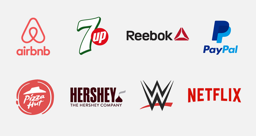
Colour is something that you should be very picky about when you are thinking about using it in a logo. By being picky I do not mean that you should be picky about which colour you like and which colour you don’t but what I mean is that you should think which colour would compliment your cause or the business.
Just as we say 80% of the conversation is non-verbal when we are having a conversation with someone. In the same way, the colour that you are using in your logo can communicate a lot of things. For instance, whether you are a brand who care about nature, or your brand is all about the party and party planning, or even if your business is based on gluten-free bakery products. Different colours would represent these different ideas successfully. So make sure to do a little bit of research on colour psychology. So that you can choose your colour wisely.
And also don’t go too overboard with the colour palette. Make sure not to use more than 2-3 colours in your logo otherwise, it can be a little confusing for the audience to relate to your logo. It might be hard to stick inside their heads. You might find that a lot of colours complements your brand, or are capable of representing your business values but you need to stick with only a few colours, otherwise, you might lose the opportunity to communicate the foundation value of your business and make it unique and recognizable to your customers.
Be Authentic-
When you are sitting to design a logo, the first thing you do is you sit on your computer and look for the similar work to know what is going on and what is in trend. The last thing you would want is your work is looking like someone else’s design. As a designer, we should respect other’s design and we should always be true to our art.
Don’t try to copy something from the work that you are inspired by, your job as a designer is to make the logo unique. Get inspired by the work that you like but try to understand the values behind that inspiration. Sometimes it is normal when you spend your time looking at a lot of stuff on the internet, something sticks in your mind and you design your own work looking similar to something else. But make sure what you have designed it totally unique.
That will always be much more beneficial and impactful for the brand that you are designing it for and for your own brand in the long run.
Minimal Design can be a winning move-

When designing your logo it is very natural to go overboard and keep on adding something with an intention to make your logo better but too many ingredients can ruin a recipe. Your purpose should be to design a great logo with the use of a minimal concept and a simple design.
The reason why you should go with a minimal approach is a logo is more successful when it is memorable, and our brain cannot retain something which is complex trust me on this one. How many of us still remember those complex mathematical formulas from our high school? Unless we were a math whiz. So keep the logo to be minimal for it to stick with the audience. That will be responsible for quicker growth and impactful branding.
Control your Creativity-
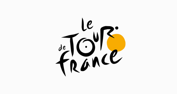
When you are designing a logo you don’t need to go bonkers with every thought, idea or a trick to add to the logo, you need to stick with that single idea that you want to incorporate into that logo.
There is a quote by Antoine de Saint-Exupéry which sums this up really well;
“A designer knows he has achieved perfection not when there is nothing left to add, but when there is nothing left to take away.”
Creativity is all about communicating a complex idea through a simple visual.
Stay away from generic Typefaces or Stock fonts-
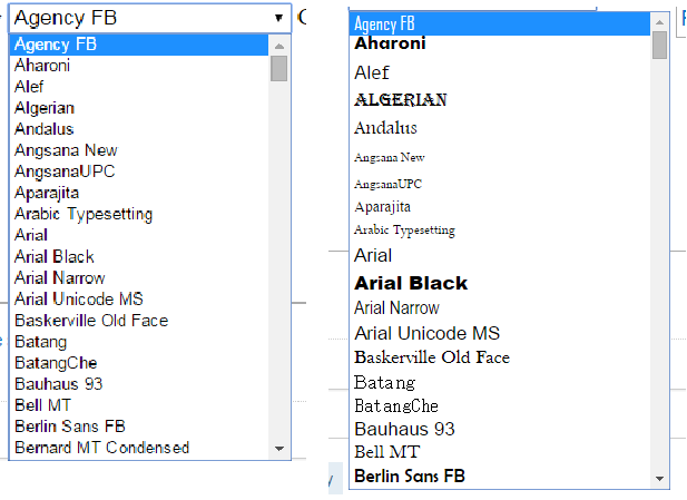
To make a logo unique the fonts you use can be really effective, so rather than using the font that you hear about daily try searching for a font which hasn’t been used everywhere. Or if you have to use a font which is too overused, you should do a little editing and customisation to make it look more unique.
This tip is important because, in order to be easily recognizable as a brand or a business the font also an important role, people shouldn’t be reminded of some other brand when looking at the font of a logo. They shouldn’t think that they have seen it before on that brand.
Think about different applications-

While designing logos don’t just think about how the logo looks on your screen, you need to envision how is it going to look later when it will be used. On social media platforms, print ads, merchandise etc.
Sometimes a logo might look great on screen but it might be really hard to get it printed on a T-shirt. It might lose its impact while applied on different mediums, so plan accordingly how is it going to look once it will be done and the brand that you are designing it for will use it for different purposes.
And if the current logo that you have designed doesn’t work. You need to either design it in a way for it to be more effective, or you need to let go of this logo and redesign it from scratch. Never be too much attached to a design. Otherwise, you wouldn’t be able to see its effectiveness in real life. Or you wouldn’t take the client’s critique in a
Make the Logo responsive-
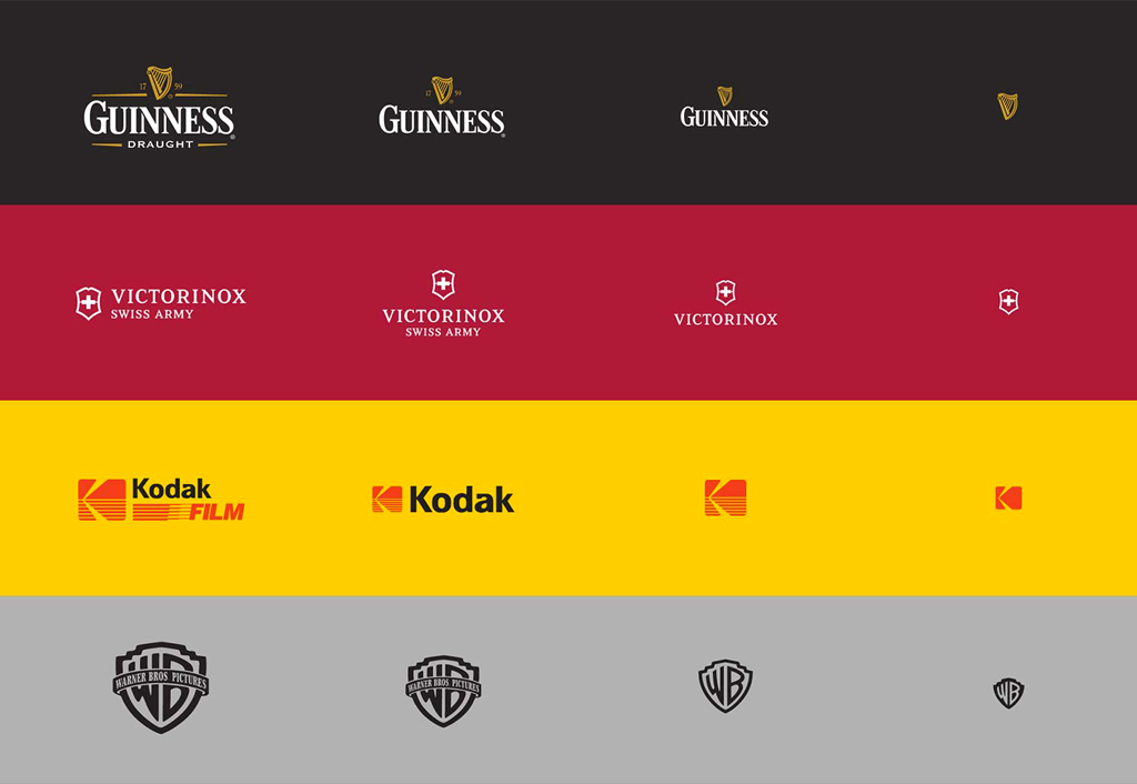
In this digital era, almost every logo has been designed keeping in mind that it would have to be responsive according to the different applications and mediums, It is just like responsive websites it has to keep up with the shrinking screen sizes. The logo gets adapted to the nature of the application or the device it has been used for.
If you are not aware that you are not keeping up to the design trends of the logos and branding.
The responsive logos are the logo design which changes shapes, complexity, size and even colours to accommodates and adapt according to their positioning.
You can no more just have a single logo in this modern age. The dogma of having just a single logo has long gone. With the complexity of mediums, devices and screen sizes you need something smart.
Which calls for a need of a logo which can be easily accommodated and adapted in order to be responsive.
Avoid Cliche-

The logo designs which are pretty generic and makes people feel like they have already seen it somewhere but for some other brand or business is named as a cliche logo. This might be really harmful to your brand image. If you don’t want that image of being a brand which is like every other brand in its niche and it doesn’t have anything new to offer then please stay away from the logo visuals which is being followed by most of the businesses in your niche rather take the challenge and try something unique.
It is not a surprise that only those brands succeed who take risks.
Balance out space-

While designing the logo you must keep in mind that the logo should not be like there is no breathing space in between the elements, and visually it can be done using contrast like colour, increased space or font selection etc.
You need to pay attention to all the visual cues, and all the part of the logo should be well organized and visible otherwise it might not be as pleasing to look at the logo. and people might feel a bit unease while looking at the logo.
You need to have a proper look at the logo and see whether the elements of the logo are getting enough importance that it deserves in order to be understood.
Make it meaningful-
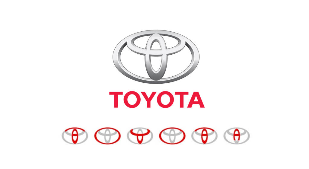
Rather than having a logo which is just there for the visual appeal, try to incorporate a deep-rooted meaning into the logo behind that logo mark. That might be helpful to make your logo more unique and to stand tall with your business.
A client might like a beautiful logo but his response would be a lot of welcoming and appreciative when you would present a logo which stands on a value that your client’s business is based on. He would be awestruck and would appreciate you for creating a logo with such individuality for his business.
So, here it is folks. My best tips for making a professional logo design. Don’t try to follow each and every single tip in your next design that might be too overwhelming, if you want to improve your logo design skills just follow one or two tips at a time. And follow them one by one.
Comment with the logo design that you have designed following these tips. I would love to see what you guys are doing.
If you know some other helpful tips that might be worth knowing or which can be added here please feel free to comment.
Thank you for reading it and all the best incorporating some of them in your next design.


1 Comment
Like!! Thank you for publishing this awesome article.