The Biggest nightmare for a designer is, what if the client hates the logo?
What if all my effort goes out of the window?
So how about if I tell you there is a way through which you can maximize the potential of the logo design. You can give the same logo that you present right now. But this time with this technique the risk of getting rejected would be 50% – 70% less. I understand that sounds too good to be true.
Trust me once you know these tips you will save a lot of time working on those irritating back to back feedbacks. These tips don’t just work with logos although after tweaking these just a little as per your particular design these tips can prove to be helpful.
I am going to share the ways that I use with almost every delivery of mine. It reduces the risk of getting my rejected. It doesn’t save me always, once in a blue moon, I do get a client who is turned off by a design which he/she doesn’t like personally. After I which I do try to make them understand why it will help his business, but not every client is easy to deal with. You must be wondering somewhere why am I sharing you with this. Simple! I understand the Designer clan.
Sometimes clients are just too stubborn to get something that they like personally. It is sometimes more harmful to the business. You cannot do much about them but you need to try to make them aware. One must try to help them as much as possible to get the best design for their business.
Let’s get a little deeper to understand how each of these techniques will be helpful and how each of it works.
Concept Notes
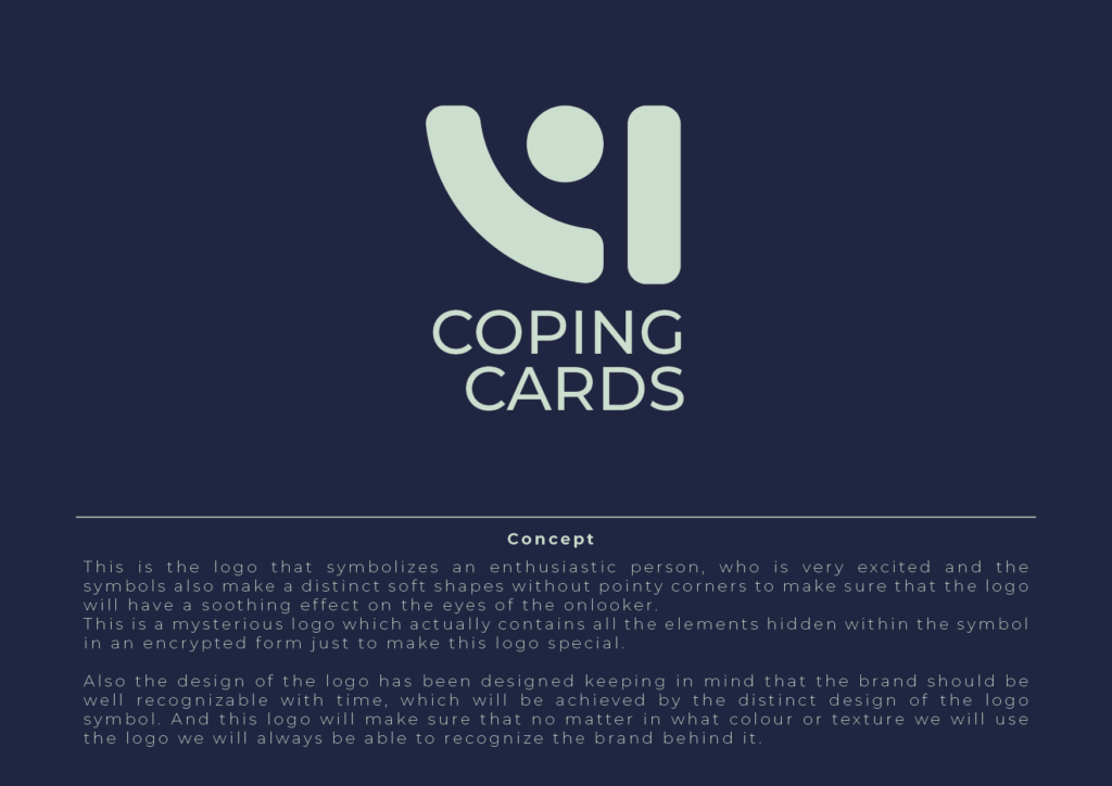
No need to feel sorry for yourself that you email your files to the clients as it is. You have to start somewhere. It is a lot easier to take it from here and turn it around for yourself. I started as a designer who just emails clients the files, getting my fingers crossed and wishing that the client would accept the designs. This way, it is a lot harder for the client to accept it. This way any of his doubts get cleared up. At this point, he probably doubts everything, and he is a bit sceptic about whether things would work the way he is expecting for them to work.
So, you have to assure them and bring them in a safe headspace. Concept notes can be a good beginning for it.
Your concept notes should explain that the design is not just something without any insight or the idea. It is a meaningful design with a good way to impress the client. If they see your logo without a concept note. It is just a plain simple computer-generated design for them, but a design with a concept note is a story them that they can own for their business.
No one wants a baseless design for their business, your concept provides a strong foundation for the design. The client is much more proud to own it once he knows what is the idea behind the design. He can relate himself of how it will work for his business.
Mockups
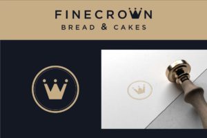

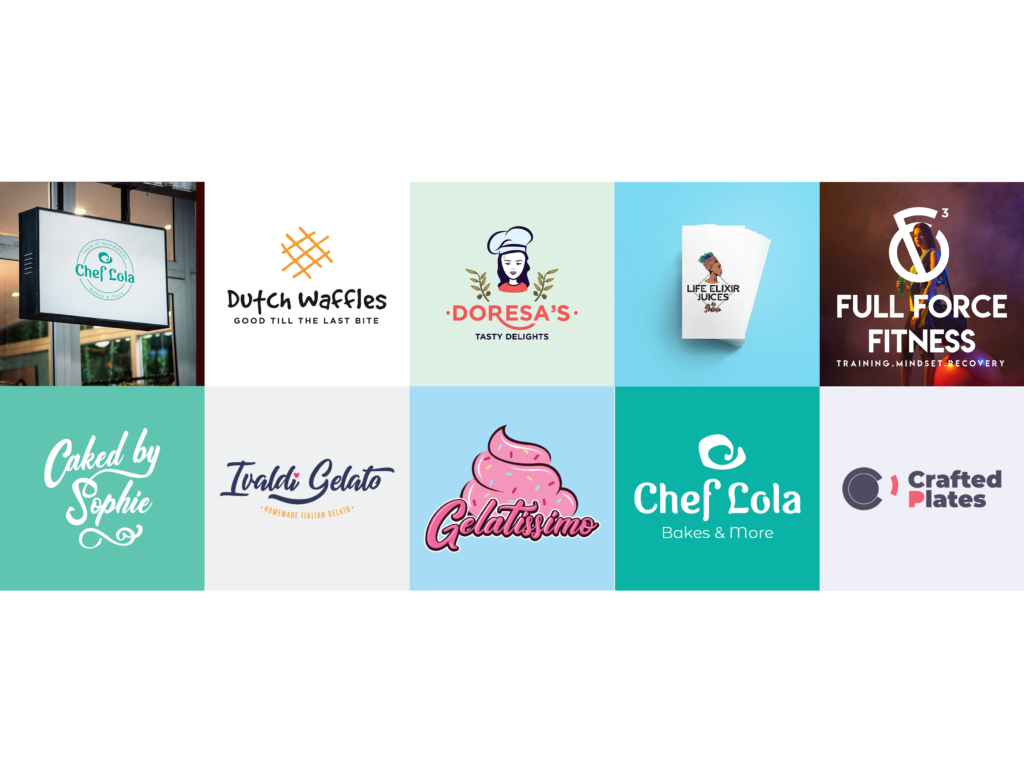
It is another way of making your designs more compelling and more impressive. When we create a design, we can easily envision how it will turn out after getting it printed on different mediums. Meanwhile, it is opposite of how most of the client thinks. They are not much aware of that kind of thinking. When we see a logo design, it might be easy for us to bring our imagination to a whole another level. It might be easy to think what it would be like to see the logo on different mediums like, a visiting card, envelope, and other small brand stationery as well as those macro mediums like billboards and hoardings.
To close the gap between the imagination of the designer and the client we need to use mockups that can present the logo on those micro and macro mediums. From visiting cards, stickers, similar small brand collaterals to those huge prints like signage, hoardings, and billboards.
Even if you think that the business is not that big to get their ad over a hoarding on a road. It still gives him/her an emotional kick to see their brand on such a huge medium. So, in this way when you push them to envision their brand as a larger brand than what they can imagine.
If you are not getting the best out of the mockups to present your designs you are missing out on a huge upside of your designs. To make the way you present more impactful and impressive. You can easily download the free mockups from the internet or the premium ones.
1. Mockup World
A great site that I would always suggest everyone use. I have been using since the beginning and I loved it right off the bat the moment I used it for the first time.
2. Pixeden
(You can get great quality free mockups as well as buy some premium ones, I do use this website a lot to download free as well as premium ones.)
This is one of the mockup sites in my arsenal that I do go through when I try to find some good stationery branding mockups and sometimes large scale mockups as well.
4. Behance
I rarely go to Behance because most of the times I can easily find it on other resources that I prefer to go to first. But this one is also one really helpful resource that you should use to download some quality mockups.
5. Smart Mockup
This is a great site I never knew since the beginning like other sites but this one is really great, it has a lot of really quality mockups that you can use to improve your logo presentation.
It totally depends on the expense of your project and how much you can afford. If you can afford those premium mockups, I would suggest you should do that because the mockups that you pay for are of the best quality and it does help our design community and the people in it.
Outcome-Driven

This phase is very important and it starts before you sit down to design anything. To execute it perfectly, first, you need to talk to the client and understand what outcomes he is after. This results in a few things number one you will have much better clarity about nailing this project on point. The client will trust you more once he feels that he is being heard and understood.
This way, he will have more confidence and faith in your judgment. Once he sees how driven you are to design something great for his brand.
Most of the designers are more than ready the moment the client tells them about the project specifications. Although! I do not say yes to the project until I have understood the little details that the client. It doesn’t even feel would be important to share with me because they have no idea what information they should provide me.
They always are more excited than you to talk about their business. And after I ask those questions they realize how dedicated I am to them. As a result that can be more beneficial to the client.
Keep a small diary or a journal in which you write the answers that the client provided you. They are going to help you when you are going to present the logos. You need to add a few lines or a paragraph of how the design is capable of fulfilling the outcomes. Design is not helpful until and unless it helps the client’s business in multiple ways.
Effective Design
The design that you are creating shouldn’t just be something which looks appealing. It needs to be effective for communicating well to the customers and the people that it is being designed for. It should also work to help the business in multiple ways only then it would be an effective logo.
A design is nothing if it is not capable of communicating well with the target audience. You have to design it thinking of how it would interact with people and what would be the emotional trigger once they see them. The design will be effective when it can do what it is created for on every platform and medium not just a couple of mediums. Wherever it is printed or on social media, it should always do well for the brand it is being designed for. Its effectiveness on big and small mediums is called its scalability. The design needs to be scalable to bring value to the business in the long run.
To know whether a design would be effective or not isn’t just about is scalability and how well it communicates, but it is also about how well it is going to work in the future. How it will keep on helping the business it is designed for even when the design trends changes. This decides whether the logo is timeless or not. It shouldn’t be designed while keeping in mind some design trend. Every design trend is likely to end at some point in time. So, make sure that the logo will always be relevant and doesn’t look out of time.
You need to keep in mind all that while designing the logo or any other design. When you present the logo, it also outline these factors of how the design overcome. These issues and help the business in the present time as well as in the future.
Potential to Represent
When you design a logo you need to question yourself about how well your design represents the brand. Whether it is right for the brand it has been designed for. Every aspect of the design should be aligned with the brand values.
Every factor like its design language, colors, fonts, typography, and symbol, everything should be in sync with the brand and nothing should be against or challenge it.
If the logo wouldn’t be in sync with the brand tonality, brand values wouldn’t work. The logo won’t be effective at all. It can even be harmful to the business. It can even result in the downfall of the brand.
Conclusion
While presenting your logo design, convince the client about its chief useful details. Tell them how the logo will serve the company’s business. Make them understand how it can help to build a brand identity. But go well prepared with a lot of slides and mockups of the logo. Make sure to remind the client about the business goals of the logo.
Stay calm and try to recreate the logo if necessary as per the improvements suggested by the client.
