Today while working for one of my client’s blog branding, I was making different logo versions, defining a colour palette and finally when I got finished with the favicon I thought there have been a lot of sites that I have seen who are without a favicon. Maybe they do not know how to turn their logo into a favicon, and because of the lack of budget, they have hired a cheap designer who doesn’t know the right way either.
So this blog is dedicated to all those people to give them the right direction to teach them how they can create their own favicon from their logo design. To design a favicon from the logo design first you need to do few simple things, dissect the whole logo into different elements, and then see how you can use the least amount of elements and put them together in a way to keep the branding consistent.
Favicons are one of the most neglected parts of the branding that people don’t give importance to. Before getting started with how you can design or get it designed, I am going to talk about the reasons why it is so crucial for your branding.
The favicon is responsible for better user experience because if you would look at those ten thousand tabs that you have opened in your browser sometimes it is hard to figure out which site is which? but when it is coupled with the power of favicon it can help you to filter through all those tabs and land on the right site without wasting too much time plus it will also help the user to associate with your branding more strongly and your users will get more use to your branding.
It will also be shown in the list of bookmarked sites when someone has bookmarked your site or a certain page of your site. Which will also result in more recognition of your branding, and your fans would be able to recognize your branding easily. I am sure you have understood the importance of favicons, I don’t need to rant anymore. It’s the right time to teach you guys to get the best favicon for your website.
I will start from showing you the logo that I was designing for that client, with that I will reveal how I transformed into a perfect favicon that can be very effective for having a lasting impression on the audience and viewers who are visiting that website.
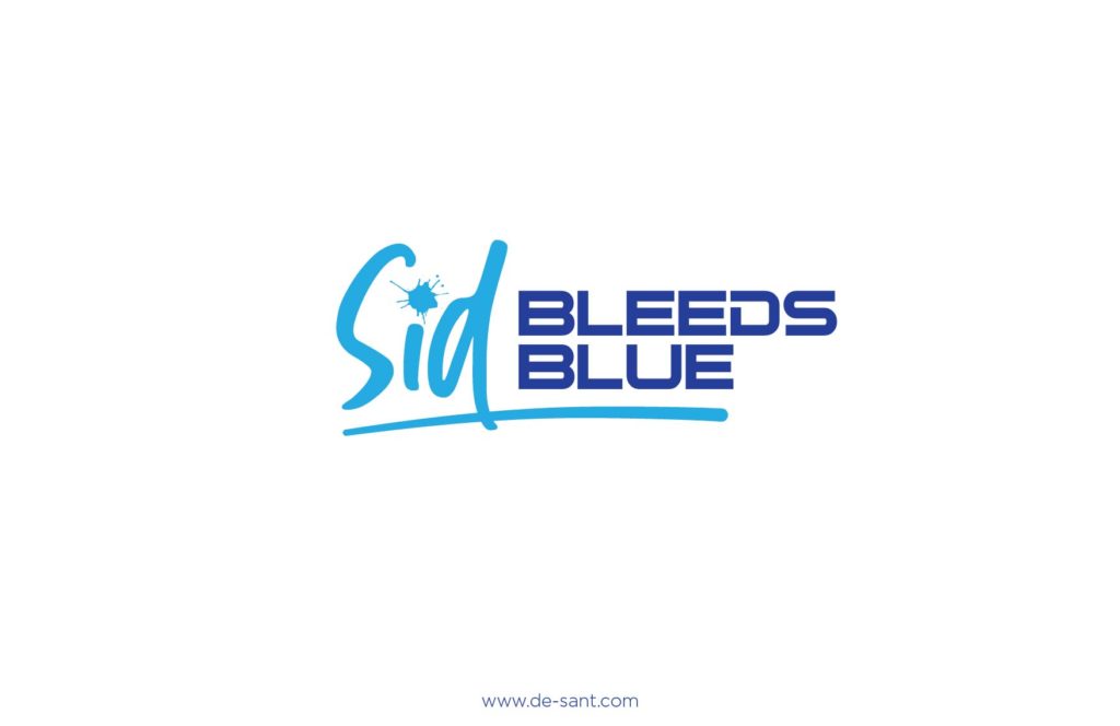
So, this is the logo that I have designed for sid as you can see. The logo is for his blog website, with the casual and an individualistic touch of the logo you can depict that sid writes about his personal experiences, his opinions and about his passion on his blog. And his love is cricket which drives him ahead.
One of the very enthusiastic and passionate clients that I have met.
I can go on and on about the things which are not related but let’s talk about what we are here for,
Step 1: Breakdown the logo design-
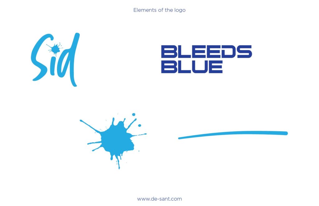
Step 2: Create favicon with minimum elements-
Create the favicon with the minimum number of elements to make it most relatable with the branding and to make it look interesting in a way that it grabs people’s attention easily while standing out from all the other favicons. Which will help your user to find your tab or bookmark without making too much effort. For this you need to try a lot of options from the same elements then you would be able to see what works best. You just need to ensure if someone would look at this he/she would get the same response as your logo just only thing which will be missing is the whole name. And you shouldn’t even use your whole name because the size of the favicon is so small that the name won’t be visible. So, to solve that you need to use a symbol, an element or just an initial to make sure that the logo will be recognizable and unique with all other visible favicons.
Now after you have tried a lot of options shortlist at least best three options. That you think are most appropriate and visually unique and appealing.
Step 3: Filter the options-
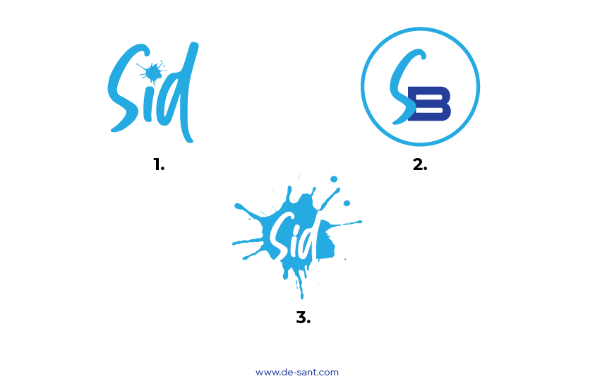
Now we are going to filter all the shortlisted options through some standards so that we can see which option will be the best, at this point, we are assuming we like all the options and we don’t know which will be the best.
Size test:
We will run the favicon through the size test, to do this what we are going to do is, we will put our logos on a very small size. After that, we will remove the logos which can’t be recognized or be seen in a small size. If it can’t be seen it wouldn’t help much to your brand.
Consistency test:
In this test, we will see whether we haven’t wandered too far from our original logo design. Although the chances of this happening are really low since the elements that we have used are all been derived from the original logo. But we will still test it to find out what our experiment has resulted in. To run this you should see whether the favicon looks like something which has been directly related to the logo and it brings the same emotion and the feeling as we get from the logo. It should look like it belongs to the same family as the logo.
Simplicity test:
You need to make sure that it is simply because only when it is simple it will be more recognizable and impactful. Simple things tend to stick easier in our mind and the more simple something is the less effort will be taken in order to remember it. The same advice I give to the people while designing a logo, it also needs to be simple. When you are complicating your design and using too many things to make it look good to me it is like you are trying too hard to make it good, and visually appealing. It needs to be as simple as possible which is actually the hardest job as a designer.
After using so many elements it is easier to achieve a unique design, but nothing is more impactful than a very simple and unique design.
Intrigue test:
Last but not the least, you don’t just try to make sure that the design that you have just made is consistent to the actual branding, visible in the small sizes, or simple enough, but you should also make sure that the design that you have just made is interesting, intriguing, and gets the best level of attention, something intriguing will always take its place in the mind of your audience, since there are a lot of brands out there who are doing just the same as you are doing you need to take advantage wherever you can.
If you want to know the tips to improve your logos by 200% you should know about some tips that can improve the way you look at the logo and these tips will help you to make yourself good at designing logos: click here to read my blog


